- 首页
- International
- 艾特奖
- 文化节
- 服务体系
-
网站导航
黑川纪章讲到:“灰色是由黑和白混合而成的,混合的结果既非黑亦非白,而变成一种新的特别的中间色。”这种混合不仅来源色彩,还来源于私密与开放空间交叠带来的舒适感。
Kurokawa said: "Gray is a mixture of black and white. The result of mixing is neither black nor white, but a new special intermediate color." This blend not only comes from color, but also comes from the comfort of the overlap between privacy and open space.
设计师希望每个空间都有它的灵魂,无论是自身还是设计给予的。本案为一家私人定制发型机构,来此的所有客户均为会员预约制,甲方希望在有限的空间内能够实现每个客户的独立性和私密性。
The designer hopes that every space has its own soul, whether it is intrinsic or endowed by the designer.
This project is designed for a customized hair salon. All the customers here shall have a membership. The salon hopes to ensure every customer’s privacy and independence in limited space.
对于同行业的门店商业体来说,除了商家的软实力竞争外,吸引人的内部空间设计作为加持则更为重要。
In the store business competition of same industry, an attractive interior spatial design is more of great significance than soft power of the merchant only.
UP hair 品牌为一家年轻的连锁发型设计机构,设计师希望能通过首家的门店空间设计来作为未来其它连锁门店的形象标杆,具有节约、视觉冲击力、有极强的品牌辨识度以及能通过社交网络平台来扩大品牌影响力。
Uphair is a young chain hair salon. The designer hopes through first store spatial design to set a benchmark for other branch stores in future.Saving, visual impact, and strong brand recognition are core and outstanding features of the design which can help improve brand influence through social networking platforms.
UP hair,设计灵感来自于“千纸鹤”,灵动却又张力,轻盈又富有力量。把这些碎片化的元素重新组合,去运用到这个空间里。
The design idea of UP hair is inspired by the “thousands of paper cranes” which are agile but tight, light but powerful. These fragmented elements are reassembled and applied to this space.
入口打破了传统的平面设计,摒弃了常规方方正正的大门式样,在这个案子中,入口处选择了倾斜状的设计。像一个张开的翅膀,内部环境若隐若现,这样的神秘感,就像是潘多拉魔盒,对顾客产生极大的吸引力。另外,结合了店面自身的狭长形结构,从而产生缓冲视线的玄关,让空间感更加灵动、多变。
The entrance breaks the traditional graphic design and abandons the regular square door style. In this design, the entrance is an open-wing sloping design which creates a looming interior environment. Like a Pandora's box that cleverly creates a sense of mystery which is very attractive to customersand this entrance will entice the customer to enter. In addition, combined with the narrow structure of the storefront itself, it creates a porch that buffers the line of sight, making the spatial feeling more agile and changeable.
吧台是一组几何形体,重复、叠加、错落。设计师通过对几何巧妙的形体组合,来满足它的使用功能和艺术效果。更能体现出它自身的节奏感和韵律。
The bar counter is a set of geometric shapes that are repeated, superimposed, and staggered. The designer satisfies its functional and artistic effects through a combination of geometric and ingenious shapes. It can better reflect its own sense of rhythm and rhyme.
进入发型区,有几个独立的造型空间,是通过折叠的墙体相互分割的,设计师希望在这里的每一位顾客,都可以在享受发型师一对一贴心服务的同时,还能享受自己的一份安静,不被别人所打扰的空间。主镜两边的侧翼和透出灯光所形成的光线相互呼应,就像“千纸鹤”翱翔的翅膀。
Entering the hairstyle design area, there are several independent spaces, which are separated by folding walls. The designer hopes that every customer here can enjoy a quiet and private one-to-one service without any disturbance. The sides of the main mirror and the light formed by the reflection illuminates the area like the flying wings of a thousand paper cranes.
楼梯一般是上下空间的媒介,独立、不可或缺又相互关联。设计师通过折叠的结构去模糊它的功能,把它作为一件艺术品在这个空间里去表达,让楼梯更加灵动、轻盈、赋予它张力和力量,可以让人去享受这个空间。
Stairs are generally the medium of space above and below, they are independent, indispensable and interrelated. The designer blurs its function by folding the structure, expressing it as a piece of art in this space. In this way, the stairs are more flexible and lighter and endowed with tension and power, allowing people to enjoy the space.
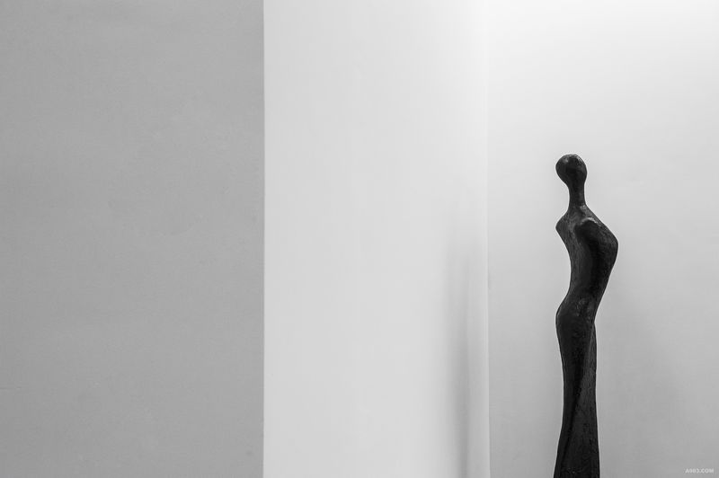
空间里的家具和艺术品,衬托出洁白的空间,使它更加灵性。楼梯上方片状的吊顶,闪现出灵动的光线,让方正的吊顶感觉更加轻盈灵动。
The furniture and artwork in the space set off a white space to make it more spiritual. The flaky ceiling above the stairs flashes a fascinating light, making the squared ceiling feel lighter and more agile.
对于每个人来说,发型设计是一件提高个人形象且耗时长的事情,那如何让走入UP hair的每一位客户都能在舒适的环境内安静的等候,是设计师重点打造的内容。因此,设计师除了在提供更舒适的环境氛围,同时还创造出了符合未来流行趋势又有艺术气息的拍照场景,能让顾客在轻松的等待同时,还能享受自拍的艺术之旅。
Another highlight of the design is a photo scene space, which meets the trend of the future and has an artistic atmosphere. The purpose for this is to make customers enjoy an artful selfie journey while waiting for hairstyle design to avoid boring and time wasting. How to make sure every customer wait quietly in a comfortable environment? The photo scene is the key to realize it.
在后期的经营过程中,设计师发现很多顾客会在空间中留影并上传到社交网络平台,提高门店的知名度和流量,从而吸引下一波客户来消费,这正是设计师预期设计的目标,设计师相信,空间设计是推动商业竞争的重要环节,通过对店铺空间的重新组合,来打造出符合客户群体的美发空间,从而帮助UP hair品牌在同行业竞争中有更强劲的动力。
In the later actual operation, the designer found that many customers enjoy taking pictures in the space and upload them to the social network platform, which greatly improves the visibility and attractiveness of the salon, so as to attract the next wave of customers to consume. This is right the initial goal and expectation of the designer. He believes that space design plays an important role in promoting business competition. By reorganizing the store space, we can create a hairdressing space that meets the customer’s requirement, thus helping UP hair have a stronger driving force in the competition in the same industry.

艺术品

一层平面图

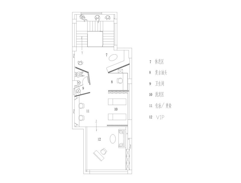
二层平面图